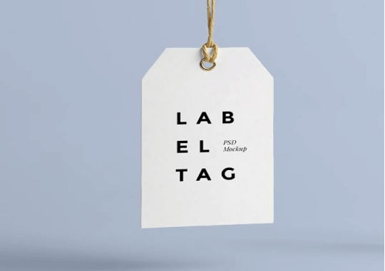
Top 5 Ways to Design the Perfect Label
Everyone checks the label; it’s just one of the customary ways of shopping. But not the name of everything is in the display, of course, it’s time-consuming, and it would hurt one’s eyes checking everything on sight. Surely, you wouldn’t want to spend a long time choosing a product that you don’t trust, you’d instead stick with the product you’re used to using, or maybe there’s this one product that catches your eye because of how attractive it looks. (Have a look at some types from deepking label)
Label matters. It’s the first impression the product can give to its consumers that will affect their spending behavior. So, what are the tips for designing the perfect label? More like, what are the tips for creating the best name or label among the products that your eyes can see? You see, there’s no such thing as “perfect label,” but there will always be the best.
Here are 5 tips that will help you make the ‘perfect label’ for your brand.
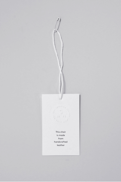
Make sure the label is readable. The font size should be legible and suitable so that people can read the name from a reasonable distance — not only the font size but also the font itself. You wouldn’t want your market to understand your brand in the wrong way. Make sure that the consumer can read the name of the product, the name of the company, or the product’s short tagline.
Maintain originality. Make sure that your label looks unique, catchy, and original. Stick with constant tags in all kinds of products for your brand, something that when a person sees such design or style, he or she remembers the brand of the product. You are looking for a label that would stand out, not fit in with other brands.
Use color wisely. Color should be used appropriately to work for your product. You can choose colors that perfectly match the product. Avoid contrasting colors. Focus on selecting complementary colors that will go together and does not hurt one’s eyes when you take a look at it. You can choose colors that communicate what the product is about; for instance, if your product is banana-flavored, then yellow is the best communicative color for the product.
Choose the label that makes consumers aware of the brand. Focus on a product-friendly name that can be put to other products of the company as well. By that, it will justify brand awareness. You may provide contact information and the address of the company. You wouldn’t want to lose business opportunities on the way.
Keep it clean and straightforward. A simple design does not connote that the product is dull and boring. Simple designs attract the consumer if the label is kept clean and direct. Do not lose the purpose of the name, which is introducing the brand by putting tons of designs on it for it to be attractive. Having too many models can be distracting, which makes the consumer think there’s a lot of things going on just by looking at the product, and it is too complicated.
Barrie
Hi, I'm Barrie, and I'm a business elite who's passionate about technology and its impact on the world. Over the years, I've built a successful career in the business world, working with some of the most innovative and dynamic companies out there. But beyond my professional accomplishments, I'm also deeply committed to sharing my knowledge and experience with others. That's why I started this blog - to provide a platform where I can share insights, ideas, and trends with other business professionals and entrepreneurs.